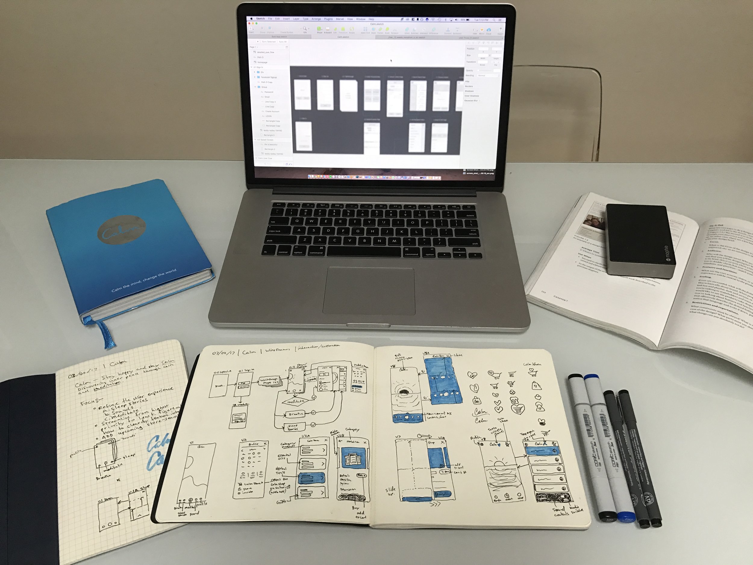
Pre-unicorn days: I met with Alex Tew (the CEO at Calm) and we brainstormed together some ideas around a new shopping experience. The goal was to keep things simple, intuitive and consistent with the brand.
Date
Jun 6, 2016
Roles
Sr. Product Designer
Team
Alex Tew: CEO
Tools
Sketch, Invision, Google Slides, Slack.
Designing a new shopping experience for Calm and more
In this case study, I will delve into my design process right from its inception. I aim to explore innovative ideas that not only redefine the shopping experience but also expand the product line, boost subscription signups, and elevate the overall user experience.
Calm's Story
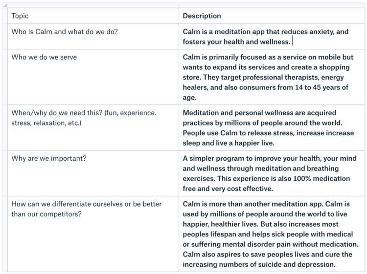
Before diving into the design work, it was crucial for me to understand Calm's ethos. I needed to grasp what we represent and the goals we aim to achieve.
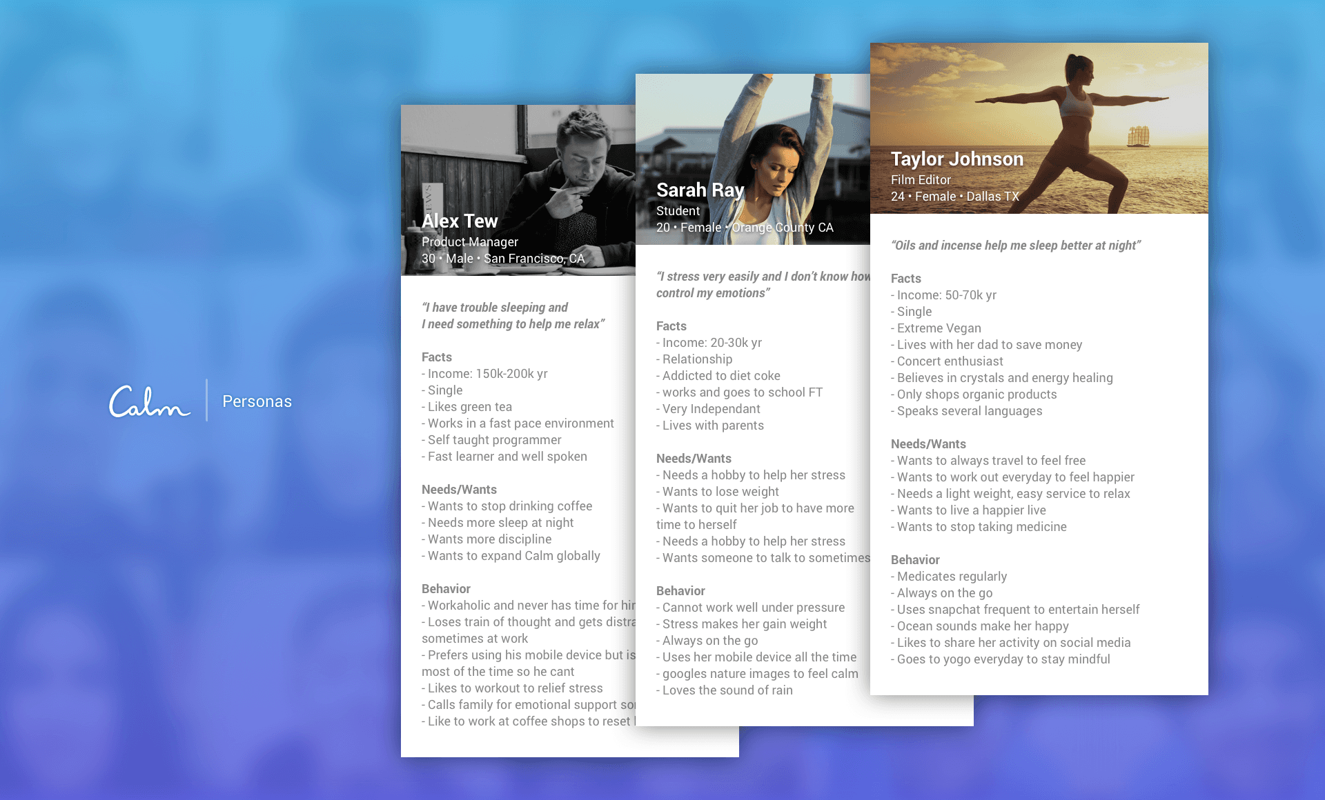
Who exactly are they, and what characterizes them?
Gaining insights into their behaviors and patterns deepens our understanding of our target audience. This not only spotlights the genuine issues they face but also unveils opportunities to enhance Calm's success. By identifying consistent patterns, trends, and understanding their needs and desires, we can transform this data into tangible solutions.
I've observed that many startups tend to neglect this crucial step. Recognizing the significance of this understanding is vital, as it informs numerous design decisions throughout the entirety of a project.
Outcome
What insights did we glean from our users today, and how can we integrate this knowledge into our product? Taking these learnings to heart can prevent us from repeating past mistakes.
62% of our users are athletic: There's evident potential here. We can explore introducing features to boost engagement among this demographic. Additionally, this indicates an opportunity to stock more athletic products in the Calm store and expand our product line.
80% are enthusiasts of oils and practice yoga: Considering the popularity of fragrances, oils, and incense, there's a potential market for us. Introducing our own branded yoga mats could be a good starting point.
26% use medication supplements: To cater to this segment, we can suggest or recommend natural herbs and teas within our app, subsequently gathering data on their preferences.
62% of our users are athletic: There's clear potential with this demographic. We can introduce features to increase engagement and add more active products to the Calm store to expand our range.
80% enjoy oils and do yoga: Given the current trend and popularity of fragrances, oils, and incense, we should consider introducing our own branded yoga mats to cater to this significant segment of our user base.
26% Use medication supplements: Within our app, we have the opportunity to suggest or recommend natural herbs and teas to cater to this segment. This can also provide us a platform to understand their preferences better.
Calm Personality
How would you describe the feeling of using Calm in just three words? This is one of my favorite questions to pose.
It's an introspective exercise designed to align the team with the brand's core identity and objectives. The responses, often a mix of the anticipated and the surprising, provide invaluable insights. What I particularly cherish about this activity is its power to spark enthusiasm and creativity. Engaged and happy teams inevitably lead to superior products, driving growth. In essence, it's a straightforward yet profoundly impactful exercise. 😃
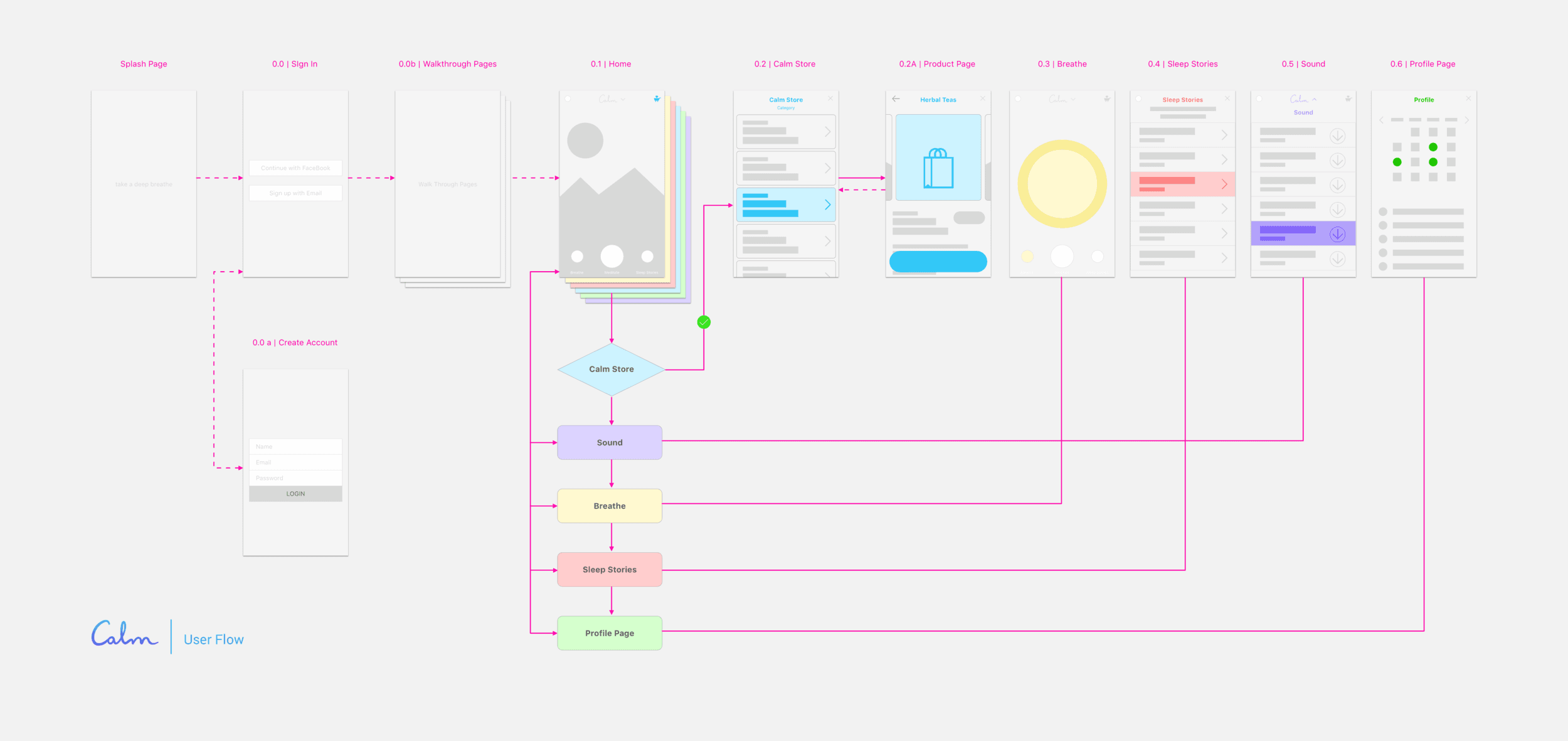
Calm User Flows
Always be mindful of the preceding and succeeding steps. Embrace and adapt to varied scenarios, but above all, maintain simplicity.
Sketching initial ideas, whether on paper or a whiteboard, is invaluable. This approach allows for spontaneous refinement and gives insight into the app's present user behavior. By doing so, we can seamlessly integrate new features, ensuring continuity in the user experience and minimizing repetitious discussions. This should be a dynamic process, regularly updated.
Our objective is to navigate the app's current flow from start to finish, pinpointing user paths. This way, we can subtly modify the experience without users being any the wiser – much like a ninja 🥋 in the shadows. My process is iterative: sketch, print, post, refine, and revisit. 📝
Calm Wireframes
Embrace simplicity.
Post initial brainstorming via sketches or whiteboard doodles, I delve into potential alternate user pathways. Interestingly, our main interface consists of just one primary screen, with other functions emerging as pop-up pages. A simple 'X' at the top-right ensures users can swiftly revert to the homepage. Preserving this user experience is pivotal – our mission isn't a complete redesign but rather an enhancement so subtle that users hardly notice, safeguarding our esteemed product reputation.
Given the existing user preference for a seamless in-and-out interaction within 'rooms', it's imperative we respect this flow. However, as our product array expands, there's a need to reevaluate the shopping experience to ensure it doesn’t deviate from Calm's core user journey or morph into just another online store. My proposal? A distinct shopping experience. Perhaps a button within the profile page that redirects users to a mobile-optimized shopping platform, allowing for an effortless return post-purchase.
This topic is rich with potential directions. Post extensive team consultations, I integrate feedback, refine the design based on business needs, and move towards prototyping. 😃
Calm Refinements
As our design began to crystallize, I took a step back to finesse the user flow, ensuring a holistic and fluid user journey. This bird's-eye perspective is pivotal, highlighting gaps and irregularities. While this stage can become intricate, navigating the myriad changes from the initial ideation provides clarity and insight, helping us refine and perfect our vision.
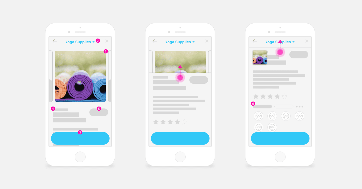
1. Product Image [primary view]
Easy carousel navigation
2. Dropdown Menu
Quickly brows different categories within the same page.
3. Purchase Button [CTA]
Fixed positioned and easy to access
4. Description
Scroll up to view more without leaving the page and forces user to interact/commit
5. Add Items6. Recommendations from friends/family
Assuming customers want this feature, we can add personalized data so users are more inclined to make mores purchases and increase sales.
FINAL SELECTION
Calm Shopping Experience
Following several iterations, we zeroed in on two final designs. We chose Version A, as it best aligned with the company's vision and ensured consistency.
Version A (chosen)


Final Reflections & Improvements
Delving into this project was both challenging and fulfilling. Starting with sparse details often unveils unexpected insights. The outcome, especially the streamlined checkout process, left me pleased. Yet, true design is a journey— it's iterative, collaborative, and perpetually evolving.
Despite the progress made, a few potential enhancements come to mind:
1. Introduce push notifications for product updates.
2. Engage directly with customers to understand web vs. native shopping experiences.
3. Collaborate with meditation communities to uncover popular products and bolster our brand.
4. Deliver personalized mood recommendations based on user history.
5. Feature synchronized global meditation sessions - an exciting prospect for community engagement.
The journey of refining a product is unending, and there's always room for growth.✨

